Bootstrap 3 SEO problem with order of columns
Twitter Bootstrap 3 is a very powerful framework for web development. New version 3 of Bootstrap has many improvements and I really like it.
However, it also has one big problem.
Mobile first Bootstrap 3 is not SEO friendly.
But there is a very nice workaround.
Why Bootstrap 3 is not SEO friendly
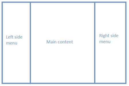
Consider the most common website example, with 3 columns.
On the desktop version of my website, I want to have a look like on the picture above.
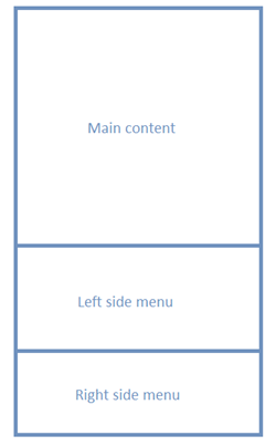
On mobile version of my website, I want to website to change the order of columns in the way that content will be displayed first followed with left and right side menus.
Following Twitter Bootstrap 3 guidelines this should be done very easily. First, we prepare HTML for mobile version of the website. Then we can use PUSH or PULL classes to change the order of columns for the desktop version.
Code for this would look like this:
<div class="container">
    <div class="row">
       <div class="col-md-9 col-md-push-3 content">
             <!-- Main Content Here -->
       </div>
       <div class="col-md-3 col-md-pull-9 left-side">
             <!-- Left side Content Here -->
       </div>
    </div>
</div>
Major issue with this approach is that HTML prepared for mobile devices generates DOM not optimized for SEO.
This way we have the content first in DOM and the left side menu bellow the content which is not recommended.
You should always have menus before content
Why you should always have menus before content? Because Googlebot is parsing DOM from top to the bottom.
Links that Googlebot finds before content will be marked as more important.
If you have menus before content on every page, Googlebot will count number of these repeating links and it will mark those links as website categories.
It will consider keywords inside those categories as more significant.
Google will try to find Niche to fit you in based on those category keywords.
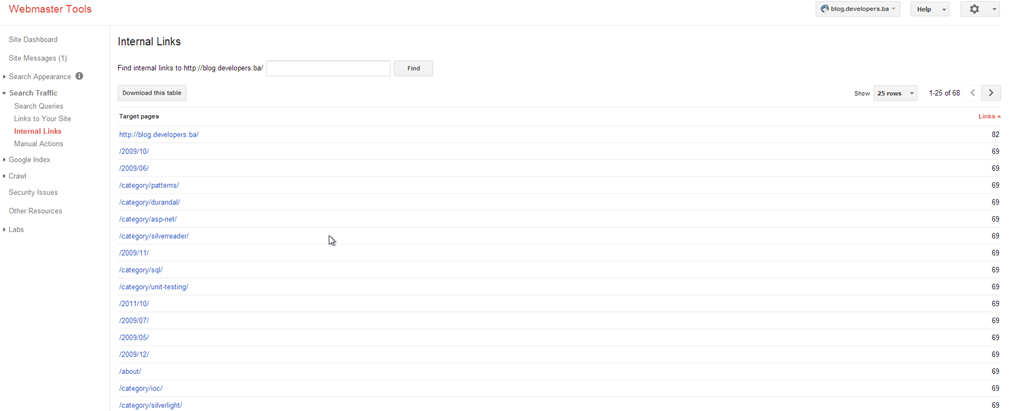
If you follow these recommendations you will see category links in the first positions in the internal links section of webmaster tool.
As you can see I also have archive pages here.That is why you should remove indexing archive pages from Google indexing on your website.
Solution to this problem
There is a very elegant solution to this problem. You should use a table in CSS.
HTML should look like this:
<div class="container root">
     <div class="row">
          <div class="col-sm-3 left-side">
               <!-- Left side Content Here -->
          </div>
          <div class="col-sm-6 content">
               <!-- Main Content Here -->
          </div>
     </div>
</div>
And CSS should look like this:
@media screen and (max-width: 767px) {
    .root
       {
        display: table; width: 100%;
    }

    .left-side {
        display: table-row-group;
    }

	.content{
       display: table-header-group;
    }
}
NOTE: table-header-group does not support padding so if you want to apply some padding you should probably wrap content in another div for padding.
If you want to learn more great CSS trick I recommend this great book:

What do you think about this? Have you found a better workaround?


