
Styling silverlight datagrid control
This article will explain you how to modify default silverlight datagrid control look.
In this example I have created new silverlight application project and add datagrid control in xaml file.I have also created small class called Person to populate test data.
public class Person
{
public int ID { get; set; }
public string FirstName { get; set; }
public string LastName { get; set; }
public string City { get; set; }
}
After I’ve set ItemsSource property of datagrid control to list of persons I have recived this error :
Message: System.MethodAccessException: Person.get_ID()
at System.Reflection.MethodBase.PerformSecurityCheck(Object obj, RuntimeMethodHandle method, IntPtr parent, UInt32 invocationFlags)
at System.Reflection.RuntimeMethodInfo.Invoke(Object obj, BindingFlags invokeAttr, Binder binder, Object[] parameters, CultureInfo culture, Boolean skipVisibilityChecks)
at System.Reflection.RuntimeMethodInfo.Invoke(Object obj, BindingFlags invokeAttr, Binder binder, Object[] parameters, CultureInfo culture)
at System.Reflection.RuntimePropertyInfo.GetValue(Object obj, BindingFlags invokeAttr, Binder binder, Object[] index, CultureInfo culture)
at System.Reflection.RuntimePropertyInfo.GetValue(Object obj, Object[] index)
Resolution is to set my class Person to be public class.
Silverlight DataGrid control has default style for DataGrid,DataGridColumnHeader,DataGridRowHeader,DataGridRow,DataGridCell… We can examine this styles, modify them and create our own styles from this styles.
To examine this styles there is great tool called SilverlightDefaultStyleBrowser by Delay
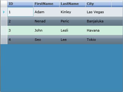
After I have modify some default styles I have got this look of silverlight datagrid :
First we need to add some new namespaces into xaml
xmlns:primitives=“clr-namespace:System.Windows.Controls.Primitives;assembly=System.Windows”
xmlns:localprimitives=“clr-namespace:System.Windows.Controls.Primitives;assembly=System.Windows.Controls.Data”
xmlns:vsm=“clr-namespace:System.Windows;assembly=System.Windows”
We must put all styles into
<Grid.Resources>
of xaml file.Now I will explain some properties of DataGridStyle.All these properties we can also set directly into dataGrid control or we can create new style that we can easily reuse later in project.
<Style  x:Key="newDataGridStyle"  TargetType="data:DataGrid">
       <Setter Property="RowBackground" Value="#CFEEDE" />
       <Setter Property="AlternatingRowBackground" >
             <Setter.Value>
                  <LinearGradientBrush EndPoint="0.5,1" StartPoint="0.5,0">
                  <GradientStop Color="#FFA3AEB9" Offset="0"/>
                  <GradientStop Color="#FF8399A9" Offset="0.375"/>
                  <GradientStop Color="#FF718597" Offset="0.375"/>
                  <GradientStop Color="#FF617584" Offset="1"/>
                  </LinearGradientBrush>
              </Setter.Value>
        </Setter>
        <Setter Property="Background" Value="#3E88B4" />
        <Setter Property="HeadersVisibility" Value="Column" />
        <Setter Property="HorizontalScrollBarVisibility" Value="Auto" />
        <Setter Property="VerticalScrollBarVisibility" Value="Auto" />
        <Setter Property="SelectionMode" Value="Single" />
        <Setter Property="CanUserReorderColumns" Value="False" />
        <Setter Property="CanUserResizeColumns" Value="False" />
        <Setter Property="CanUserSortColumns" Value="True" />
        <Setter Property="AutoGenerateColumns" Value="True" />
        <Setter Property="RowDetailsVisibilityMode" Value="VisibleWhenSelected" />
        <Setter Property="BorderBrush">
             <Setter.Value>
                 <LinearGradientBrush EndPoint="0.5,1" StartPoint="0.5,0">
                 <GradientStop Color="#FFA3AEB9" Offset="0"/>
                 <GradientStop Color="#FF8399A9" Offset="0.375"/>
                 <GradientStop Color="#FF718597" Offset="0.375"/>
                 <GradientStop Color="#FF617584" Offset="1"/>
                 </LinearGradientBrush>
             </Setter.Value>
         </Setter>
</Style >
As you can see on picture of dataGrid RowBackground property represent color of each row and AlternatingRowBackground property represent color every second row.If we set these two property to be equals all rows in grid will be same style.I have put code from borderBrush into AlternatingRowBackground property to get linearGradientBrush efect on every second row. SelectionMode property determine will multiselect support will be enabled or disabled.It has two values single and extended.
Very imortant is to set Grid.Resources above DataGrid control becouse if we try to set style of dataGrid and resources are bellow, dataGrid can’t see those resources.After we have modified default style and put that style in Grid.Resources we just add this code to apply style to dataGrid:
Style=“{StaticResource newDataGridStyle}”
where newDataGridStyle is name of Style that we have define using x:Key .
Also many people ask how to change background color of DataGridHeader.It is easy to accomplish by modifing default DataGridColumnHeader style. We just need to change
< vsm:VisualState x:Name=“Normal” >
and put some code for getting efect like on picture above:
<vsm:VisualState x:Name="Normal" >
     <Storyboard>
        <ColorAnimationUsingKeyFrames BeginTime="0" Duration="0" Storyboard.TargetName="BackgroundRectangle"
Storyboard.TargetProperty="(Shape.Fill).(SolidColorBrush.Color)">
             <SplineColorKeyFrame KeyTime="0" Value="#0A2752"/>
        </ColorAnimationUsingKeyFrames>
        <ColorAnimationUsingKeyFrames BeginTime="0" Duration="0" Storyboard.TargetName="BackgroundGradient"
Storyboard.TargetProperty="(Shape.Fill).(GradientBrush.GradientStops)[3].(GradientStop.Color)">
             <SplineColorKeyFrame KeyTime="0" Value="#366AB5"/>
        </ColorAnimationUsingKeyFrames>
        <ColorAnimationUsingKeyFrames BeginTime="0" Duration="0" Storyboard.TargetName="BackgroundGradient"
Storyboard.TargetProperty="(Shape.Fill).(GradientBrush.GradientStops)[2].(GradientStop.Color)">
             <SplineColorKeyFrame KeyTime="0" Value="#ACC4E7"/>
         </ColorAnimationUsingKeyFrames>
         <ColorAnimationUsingKeyFrames BeginTime="0" Duration="0" Storyboard.TargetName="BackgroundGradient"
Storyboard.TargetProperty="(Shape.Fill).(GradientBrush.GradientStops)[1].(GradientStop.Color)">
             <SplineColorKeyFrame KeyTime="0" Value="#ACC4E7"/>
         </ColorAnimationUsingKeyFrames>
      </Storyboard>
</vsm:VisualState>
I hope that this article will be good starting point for you to create your own styles for dataGrid control.
Source :
http://msdn.microsoft.com/en-us/library/cc278066(vs.95).aspx
http://msdn.microsoft.com/en-us/library/cc189093(VS.95).aspx
Justin Angel
February 4, 2009 at 8:04 pm (15 years ago)Hi,
This an excellent blog post. Thanks a bunch for putting it together.
We’re making an investment in making more controls easily styled from Expression Blend.
One of our chief goals is being as designer friendly as possible. Hopefully you can start seeing that fruits of that work in DataGrid soon.
Sincerely,
— Justin Angel
Microsoft Silverlight Toolkit Program Manager
Radenko Zec
February 5, 2009 at 3:44 am (15 years ago)Thanks.I am very happy to hear that from you.
Terry Walker
March 22, 2009 at 12:13 pm (15 years ago)That’s great, I never thought about Styling silverlight datagrid control like that before.
Radenko Zec
April 27, 2009 at 8:56 pm (15 years ago)Thanks.